 simpleicons.dev
Showcase your skills on your GitHub README or resumé with ease.
Icon data from simple-icons. Use official slugs as identifiers. The npm package is a version marker for the deployed service, not a programmatic SDK.
Quick Start
Paste this into your Markdown:
Replace the icons value with a comma-separated list of slugs from simpleicons.org.
Examples
Light theme (shown above)
Dark theme
Two icons per row
Single icon without card background
Custom background color
Custom icon color
Showcase
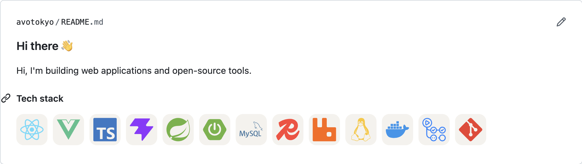
Real-world usage in a GitHub profile README — skills badges rendered via Markdown image embeds.
API Reference
GET https://simpleicons.dev/icons returns a combined SVG for Markdown embeds.
| Parameter | Required | Default | Description |
|---|---|---|---|
icons | Yes | — | Comma-separated slug list (max 100 icons). Find slugs at simpleicons.org. |
theme | No | dark | Card background theme: "light" or "dark". |
perline | No | 15 | Icons per row in the combined grid (1–50). |
viewbox | No | — | Set to "auto" for a raw 24×24 single icon, or a grid without card backgrounds for multiple icons. |
color | No | — | Custom card background hex color (e.g. F7DF1E, no # prefix). |
iconColor | No | — | Override icon path fill color (hex, no # prefix). |
Icon slugs are listed at simpleicons.org and in the official slugs reference.